Showing posts with label painting. Show all posts

Wednesday, May 20, 2009

Green Machine (not John Deere)

Notice I completely didn't use the words "green meenie" in the title. Wait... oh crap!
To continue the saga from last post, I didn't want a totally red force for my Karchev Landmark 500 point list. My two 'Zerkers were going to be red and black, and as seen, my Destroyer was blue. This left the Juggernaut. Being a former devotee to the Dark Angel SM's, I thought a nice DA green scheme would be cool. Not so!

Apparently DA green neither blends with nor is highlighted by any other green paint I could lay hands on. My first pass was so hideous, I took it back to base coat and began again. for those of you following along, yes, I had trouble with both the Juggy and the Desty. hmmmm.....

Here again we see my new obsession with stark line highlighting. The lightest shade for my green was a little too bright...I think it stands out too much. As before, I have the shading lines lain out wrong; they radiate from the side- outward instead of a more correct top-downward. All this realization came as I was laying on the sealer, of course.

A detail of the thing I used the Juggy to stand out. Number 516 likes to use looped barbed wire in the open fist! That crazy 'jack! I just drilled a little hole at the join where the fist balls up both top and bottom, and cut short lengths of the GW barbed wire and super glued them in! Ded 'ard!


In the original Warmachine rulebook, in the painting section, was where I found about about Tamiya 'Smoke.' I tried it and have loved the results it produces on metallic ever since. I don't think I have black or armor washed anything since I started using it. It is a thick consistency, and need to be thinned with Tamiya thinner before application. It produced all the shading on the metallic visible here; the shade line on the arm, the smokestacks, the boiler, and the black lining on the leg armatures.

I used more of the GW Dwarf Bronze here as it seemed to stand out so much more than the standard Boltgun metal. Also, I tried my hand at some weathering with GW Tin Bitz on the legs and feet to show rust and wear. Not really happy with the results. It just looks like I was sloppy with paint. : (


This was a quick detail of the Ice Axe. After this, I lay on both a heavy dry brush of P3 Frostbite, and a heavy lining of the hard edges of the axe as well. Since then I have flocked the base and finished sealing the mini! Ready for action!

Tuesday, May 19, 2009

Which came first?

The jack or the story?

Well, the jack. I have owned this Destroyer for 5 years now. I got a second Khador Battle box the first winter I played Warmachine...that means either Winter 2003 or Spring 2004. I got it when a LGS wasn't sure WM would last and was selling all the stock off at 30% off. Even then I had planned for a second paint scheme of winter white, the reason I got it.

So, the Landmark battle betwixt Red and I is coming up, and I decided to go a little crazy, fielding a Kharchev 'all-jack' list. I decided an all red force would get amazingly boring quickly, so I decided to spice things up. I had decided to paint two berzerkers; one red & one black, (Much more on this later.) This left the a Destroyer and Juggernaut. Avec la Destroyer!

So, once I thought about making the Destroyo blue...well, I lost my way. I tried GW Storm Blue thinned with ink, and the whole thing came out so dark it was almost purple! Ick, not my vision at all. Not that I had a vision then, but if it's wrong, you just know it, n'cest pas?

So, it was at that point I remembered that during the Legends story line, Khador had finally kicked those Cygnaran interlopers out of Northguard. What gets left behind in such matters? Incidentals like, say, paint! Rubbing my hands in child like glee, I drug out my copy of Prime and began reading the Cygnar painting guide. Whaddya think?

Here you can see my new-found obsession with line based shading. I kept the contrast bold, but totally screwed up the lines themselves. It was only after I was mostly done with this one, and the Juggernaut when I realized that the highlight should be sitting on the top of the shoulder instead of sloping to the edge. Well, lesson learned is all I can say. -sigh- Neat how the flash brought out the orange coals in the grate....

The story behind the paint was that this Desty was damaged and in need of repair, and finding the supply lines stretched, mechanics helped themselves to stuff left behind from the protracted struggle. Desty got done up in Cygnar colors first as a mockery, but then as more of a tribute to the brave fallen during the months of battle and siege.

This was also my first attempt at battle damage. I had read about both opinions, either only paint, or paint enhanced real damage to the mini. Prior to priming, I severely scratched up the surface of the right shoulder and left cuisse. I got no real satisfaction from what I did. I laid in some GW Tin Bitz, then highlighted with lighter and lighter shades of metal. All I got was murk. There seemed to be no way for it to stand out. The flash washed it a little bit too, sorry.

Also, since the photo, I completed the final detailing and flocked the base. final piccys may have to wait until Landmark battle day.

Thursday, May 14, 2009

Picture Day 4 - That darn Camo-diak! (wip)

The more pictures I extort from Red, the more i have to write about. It's weird!

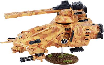
So, this little project started out an article about how to paint a Tau Hammerhead. It detailed the stippling technique, and I thought I could adapt it to the Kodiak. I do not find myself among the fans of the rather drab 5th Border Legion brown-green of the 'standard Kodiak.'

So, I present, the Camo-diak, as a work-in-progress. The more I worked on the stippling technique, the more I realized the 4-5 step technique as detailed in the article was well suited to large armor plates and the like, and less so for War jacks with bendy parts and such. In at least two of the steps, I completely undid the stippling of the previous step. As a new technique, it still requires a little experimentation.

The final step in the article was to tape off huge lightning-bolt shaped sections and paint the still uncovered areas with a sandy-tan. Ummmm...no. I was really in like with the stippled areas. I think it provides a nice transition from deep woods to rolling hills. Since it is still a work in progress, I haven't decided on the final metal accents in the shoulder area. I usually prefer GW Dwarf Bronze for the roller-ball shoulders, but the Kodiak has an armored plate modeled over it, so I may do some more thinking.
The Kodiak is a more advanced design, as detailed by the fluff, and I wanted to highlight that with my paint scheme. I usually do a Bronze and Boltgun split for the stacks. Kodiak has a different cast than the standard design, so I did solid Boltgun with some heavy staining. Also, the advanced boiler design is designated with the Boltgun boiler cap as detailed in a previous post.

Overall, on my first attempt, I wasn't really happy with the final result. In a few places, the increasingly light over-stipple blurred the subtle under colors. There were places I blacked out and started over. I also began thinking about color changes for the next Kodiak I paint in this way. Oddly enough, about the same time I was thinking about the next one, Indiana had "the last big snowfall of the year." Heavy and wet, I was able to see, the snow laden pine evergreens. I have some exciting ideas for Mark 2 and 3!

The end result was fairly murky, privings its worth as a Camo scheme! However, it was a little drab. As shown, I painted a fairly intense and heavy edge line on most plates with a slightly brighter color than the final stipple. The great part about stippling is that you don't have to do all that time-consuming shading and blending. Don't get me wrong, (if I fall to a mode of fashion) I think the end result of my standard paint job is quite good. This has its merits too. The variation in color of stipple adds depth.
This final pose allows me to expound on final colors. The fist plates will be black, with metallic spikeys. The back of the fist plates will be solid black. with a dark paint job like this, the scratches and dings of final weathering will stand out better, as well as some mud and dust and a little rust. all the good things in life!

Monday, April 20, 2009

Painting Notebook - New use for Ink?

This is me humbly thanking Red for his suggestion about applying a layer of ink over the base coat. I have applied this technique to 3 (and maybe one more) minis I am prepping for the Landmark 500 battle.

I have to say, I think it makes lighter color pop more than the darker colors. It didn't really work out so well for blue...GW blue ink dries really shiny and didn't let much of the under highlight pop through. The jury is still out on black. My old technique of a black glaze (just thinned black paint, but a thicker consistency than a wash) may be a better application for toning down the gray highlights. I hold better hope for green, since the ink is from P3. This technique works wonders on red. Thanks Red! Future legions of Khadoran warjacks will be better painted, thanks to you!

Too bad there isn't a Gray ink. I have a big project involving a lot of gray. I guess a thinned out highlight of black may work as well.

Edit:
Revelation!
Well I tried the green and the results were equally disappointing as with the blue. I now think I know the problem. The ink just didn't flow like a wash. (I know I know, duh!) It dried in clumps and splotches. So, if I try this in the future, or if you dear reader, try it, either thin the in with a little water, or try the ol' Future floor wax trick.